
Goof! wasn't just another doughnut shop, it was a rebellion. A stand against everything that's gone soft (and stale) in the category: pastries sitting behind glass for hours, mass-produced sweetness, and the slow death of the doughnut as a moment.
The challenge? Build a brand that reminds people what a doughnut is actually for : hot, fresh, eaten with both hands, and a little bit unhinged.
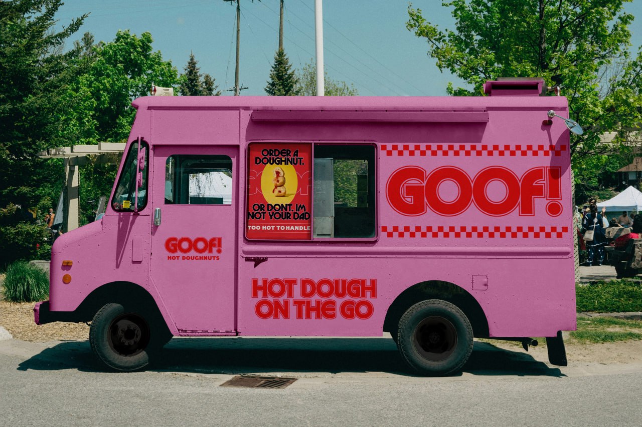
We designed Goof! like a retro doughnut joint on a sugar trip, familiar, but a bit freaky. Warm, but unhinged.
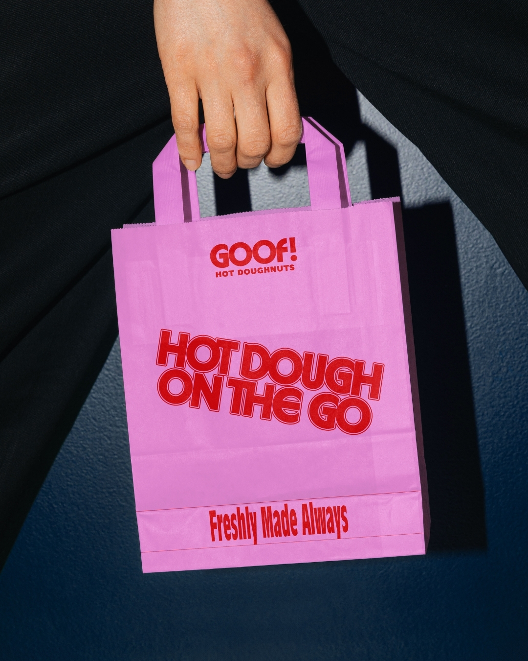
The wordmark borrows from 70s diner signage and lands somewhere closer to a soda fountain on caffeine. The pink-and-red palette is intentionally loud, intentionally fun, intentionally not trying to look "premium" because the second a doughnut starts taking itself seriously, it stops being a doughnut.
"Too Hot To Handle" became the brand's whole thesis, carried across the food truck, the paper bag, the A-frame sign, and the doughnut cup: food made for you, not for the display case.
Because great snack branding isn't about looking expensive. It's about making people feel something the second they walk past.


.gif)


